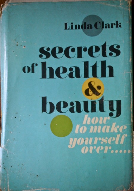


I was exploring the depths of my basement the other day and came across these books. My favorite is the first one, but I think they all have something interesting going on. (I remember the Animal Farm cover from Scott’s post a while back.) The typography of each cover is worth noting — especially the beautiful implementation of the lowercase Carousel on the “Secrets of Health…” cover! The ampersand in particular is pretty amazing. As much as I love Bodoni and Didot, Carousel has a few extra twists that make it more exciting to me.
Sometimes I wish I didn’t live in a design centric city; all the used bookstores were plundered long ago of anything with cool design at work. It is a rare occurrence that I find something worth buying at even the most remote vintage bookshop. Got out here too late!
Apologies for the iPhone photos — it was all I had at the time and I couldn’t pass up the chance to snap some shots. Also worth noting is the price of some of these…when was the last time you paid 25c for a book?


Very nice:)
Anybody know the font used on “Secrets of health and beauty?”
What a sweet “b” and “a” 🙂
looks like sort of a curvy bodoni or normande but cant’s find it…
^hmmm.
i would have said didoni, or maybe caslon 224. alex has it though. that italic ‘k’ is so dope.
Not sure if they have Goodwill in the States, but this is where I get all my stuff. Lots of Penguin Classics from various decades.
Thanx for the reply!
Seems that it’s Didoni, and Calson 224 is close with more versatility
baaz- It’s Carousel, as mentioned in the post. Gorgeous typeface
Следите за пульсом блогосферы на Яндекс-Блоги? Оказывается скоро Татьянин день.
I think the iphone photos add something to each. I love the blurred letters on the Arthur Miller Book. That was from the photo wasn’t it, not in the actual design?
Здравствуйте вы не думали о продаже ланного сайта?, интересно было-бы узнать цену, если можно отпишите на мыло
With regard to the title ISO50 – The Blog of Scott Hansen » Vintage Book Covers, it kind of took me aback for a second but finally I get it. I’ve been wondering the same stuff at my blog http://sjamessmith.livejournal.com. I’d honestly like your thoughts on what I talk about. Catherin To