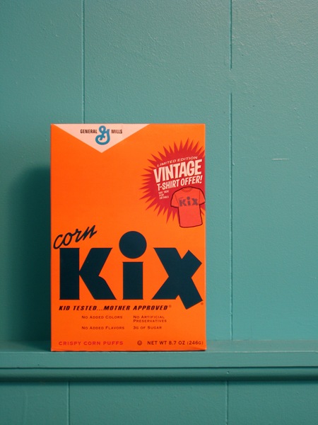
Apparently this is a throw-back box, so you might still be able to get one. The colors are great and gentlepurespace’s choice of backdrop is perfect. Just another illustration of how product packaging today sucks. Via FFFFOUND.
Vintage Kix
04.26.2008


i agree about the packaging desing of now a days, to much information on it. i thought this was genious though : http://ffffound.com/image/5a1ca08b0c3a9d589f717c5c313a4ad6f6c76202
Wow I loooooove Kix too
Agreed on how shitty most product packaging has become nowadays too…
I walked past these cereal boxes in the store the other day 😉
I see that the “vintage” style is minimalist, and the current style is bright and poppy. (Like GNOME and KDE.) The way I see it, it’s eye-catching, colorful but clean, informative (photo of the product is a good thing). The box pictured above is interesting in its layout, but it does not make me hungry for Kix, or even tell me what the heck Kix is. I don’t watch TV or look at paper ads. But I like to know what I’m buying.
I’m no graphics/design major, but this still interests me greatly–enlighten me, why is the current design of the Kix box shitty?
I do agree the photo itself is pretty. That is a nice backdrop for it. 🙂
Nugg: well personally i immediatly thought it was a washing product?