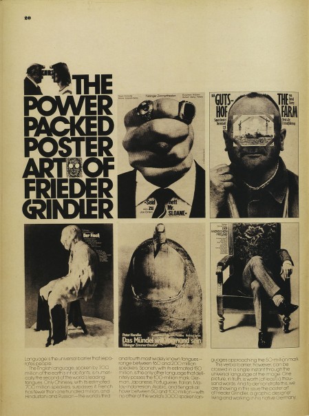
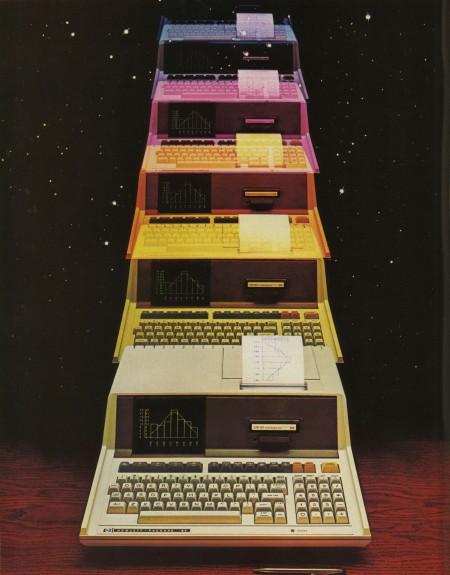
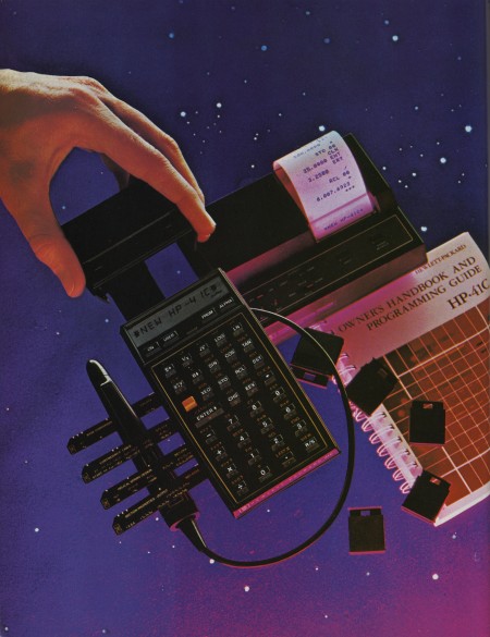
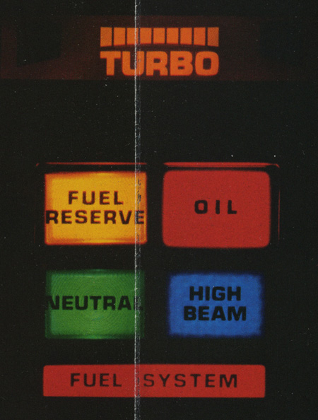
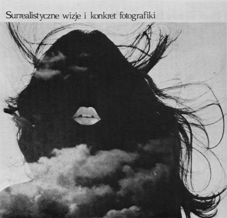
Eric Carl (who also brought us these vintage sci-fi book covers and these classic logos) has a beautifully scanned set of vintage ads from magazines up. They’re all high res so it’s a goldmine for textures and overlays. I love how magazine print breaks up at high resolution. The moire patterns are very useful when blown up in compositions; I use them a lot for posters.
Vintage Magazine Scans
05.17.2010


if u like that style, i recommend a magazin called “twen”, designed by the genius willy fleckhaus in the 70ies. and if u like fleckhaus, u should take a look at the edition suhrkamp. don’t know why i recommend that now, but it’s also awesome.
wow!
i love them!!!! Really nice!
Nice one Scott, and since you’ve mentioned it, any chance of elaborating on overlaying/texturing tricks of the trade? Not really like a tutorial, simply more detailed insight of what you’ve already said here, in another blog post? 🙂
Looks like the IBM 5100, John Titor would be proud.
Not an IBM 5100 – but a very similar form factor. It’s an HP-85. You can see the HP logo in the lower left.
http://www.old-computers.com/museum/computer.asp?st=1&c=353
I collect old TV Guides from the 1970’s so I’m really loving these–good post!!
luvin it! interesting “GR” ligature in THE POWER PACKED…part.
Thanks for the link Scott, was wondering why Flickr activity shot up today. 😉
hot
WoW… The last one is in polish 😀
you mentioned using these pictures in new work..are there any restrictions on using these in a new design? Is in this case Eric Carl who one should contact about rights?
just curious;)
you mentioned using these pictures in new work..are there any restrictions on using these in a new design? Is in this case Eric Carl who one should contact about rights?
just curious;)
What is the font in the first picture?