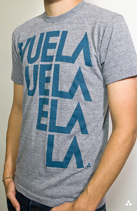
Spring is finally creeping into town (although very slowly here in San Francisco) and I’ve been way into the AA tri-blend tees this year. So I printed up a modified version of the Vuela Print on Heather Grey tees for your sunny weather enjoyment. As always, you can get yours over at the ISO50 Shop. I’m also clearing out a lot of the older designs to get ready for summer so you’ll find lots of shirts marked down 20-30%. All marked down shirts are the final pressing of that particular design/colorway.
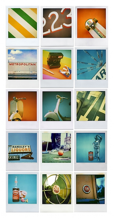
On a related note I’ve been spending a lot more time trying to learn the ins and outs of product photography. I’ve been shooting the products for years but I’ve never spent enough time worrying about the color accuracy of the output. After all this time working with cameras you’d think it would come easy, but I was surprised to find how difficult it was to get good shots when the goal is creating a color accurate representation of an inanimate object. With my creative photography I’m always trying my best to make things appear inaccurate and I guess old habits die hard. For the shots above I used a tungsten photo bulb/can light along with a Quad CF lamp from Calumet. I had been using 3 lights but it turned out that hitting the subject from the right side and front with lights and letting some natural light in from the left (there was a window there) made for better dynamics so I’ve been sticking with the 2 light setup.
The last couple product shoots were the first times I’ve used a Gretag card to calibrate the camera color temperature under the lights. That and shooting in NEF RAW really went a long way to getting a solid foundation, but there was still a lot of work done in post. Having the calibrated monitor definitely helped at that point, but the real key I found was changing my own perception of the image and training myself to see it in a different way than I’m used to. I always catch myself slipping and trying to make the shots look interesting or enhanced and then have to step back and realize that this needs to be a literal representation of the real object. At any rate, I’ve got a ways to go (can’t even imagine how they get all those high end fashion shots) but it’s been surprisingly interesting learning the subtitles and nuance of a new kind of photography. It certainly is it’s own art form. I’m sure a lot of you have some product photography chops, feel free to share any of your tricks of the trade in the comments.
Also, I know I’ve been promising it for a long time, and I assure you, a very detailed post about color calibration is on the way. The project has sort of taken on a life of it’s own and I’ve brought Alex on board to help with research and production. We’re going to be shooting an interview with a color expert in the next couple weeks and we should wrap the post soon after that so stay tuned!


I need to give shooting in RAW another shot. I always shoot in jpg and never really saw a huge difference between the two. Maybe if I was trying to shoot more color accurate photography it might make a big difference but for my style, I’ve gotten the same results with both. Product photography is a totally different art form.
I’d love to get my hands on a nice big soft box though and a few other pieces of lighting for more color accurate and cleaner looking portraits. That shit is expensive though!
And about that post about color calibration… yeah, post that up before I have zero internet while driving from UK to Mongolia this summer haha. I haven’t found any decent articles on it yet on the interwebs.
Those 3 dot looks very Freemasonry.
I know this is probably going to ruin this T-Shirt for everybody, but when I saw this design, I could only think of Rihanna’s Umbrella song.
Umbrella, ella, ella, eh, eh.
totally ruined it Daniel.
I love your apparel shots. Very close to the real thing. I love my ’76 Heather shirt.
I’m no pro, but I took over 3000 shots of cosmetic and skin care products for a client recently and learned a few things by trial and error.
I used a cheap lighting tent setup similar to this:
http://tr.im/krcs
I learned my ‘kit’ lens that came with my Canon wouldn’t cut it for detail and clarity. I invested in ‘L $eries’ lenses and it makes all the difference in the world. If it’s not sharp, the image is worthless.
If you’re taking many shots over weeks or months, the more you can isolate your scene from light interference and recreate the same conditions, using your same lighting angles and camera settings – you will save hours/days in photoshop and your RAW conversion workflow. For products like cans, small boxes, bottles, etc., I curved a piece of white coated sheet metal inside the lightbox to provide a natural reflection on a white background with no visual horizon.
Reflecting light using small pieces of white / black foam board (out of frame) can make all the difference. Just placing a dark piece of foam board can soak up a nasty highlight that’s been giving you trouble.
I’ve still got a lot to learn about photography in general, but using these techniques convinced the client I was a pro, and received referrals! 😀
Here’s a sample shot:
http://tr.im/krk1
yeah thanks Daniel, now im gonna wear it only……..ALWAYS! because I love that song FOREVER. (I said this all in my best Will Arnett voice)
Hahaha, help us all 😉
Hey Scott,
I have most of your tees and i also just got the new one. Can you make some more graphic tees on the Heather Grey? i love the shirts btw.
Thanks
Cool T + good job on the photography! Gotta ask, why the 3 dots? (people might think its a Huffer T is the only prob)
who’s huffer? I use that logo for my signature line on posters, and now started using it o the shirts.
huffer’s logo is not three dots straight up and down, but are cocked just a little bit…
btw, great work on the Tee!!! I will be looking at it everyday until I purchase it…
thanks viking… I looked them up, I see….I guess that’s a pretty common form, is huffer a big enough company that there might be some confusion?
They’re well known over here in NZ & believe they have some success overseas. You’re designs are way more refined, only concern woud be southern hemi, wouldn’t want people thinking it’s theirs!
I just bought this yesterday. This will be my 3rd ISO50 shirt. It’s funny to be complimented on them by non-designers. They’ll be like “1976, I remember that year” or “Did you get that from Urban Outfitters” but I know better.
Support your cause. Support good design.
The first thing i noticed was the 3 dots logo.
I thought ISO50 is releasing some tees on Huffer.
Yea, the logo is exactly the same.
I am looking at my huffer hoodie now.
It is originated from NZ and they have quite an international market.
You can take a look http://www.huffer.co.nz
But yeap, it is just such a coincidence the 3 dots are the same (:
Other than that, it is still almighty Scott Hansen’s style.