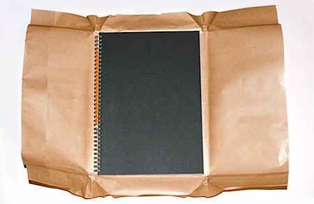
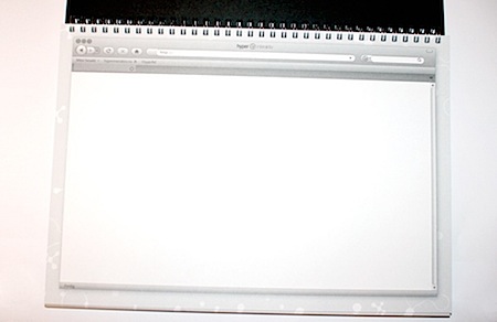
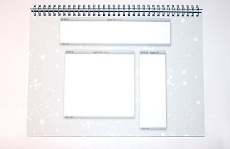
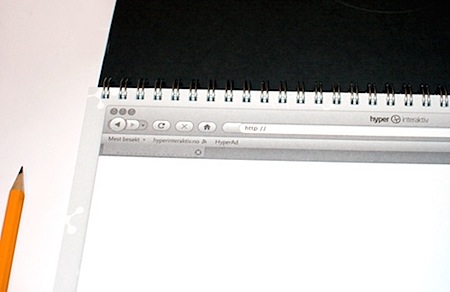
This is a pretty clever concept, a real sketchbook for web mock-ups. I think I’ll stick with Photoshop but this would probably be fun now and then. Via Paranaiv
Web Design Sketchbook
12.30.2008


This is a pretty clever concept, a real sketchbook for web mock-ups. I think I’ll stick with Photoshop but this would probably be fun now and then. Via Paranaiv
Comments are closed.
Giving so much attention to this is just ridiculous. Five years ago, when I was 15, I also printed a notebook like that, using a screenshot of a blank IE 5.5, and I never thought it could be something to show on the internet as something “really cool”, “a pretty clever concept” or anything like that.
ok, genius!
it does nothing more than present your layout drawings in the context of them being in a browser. useless.
I start all web designs with sketches before moving to Photoshop, so having a tool like this would help better envision how the concept might sit on the screen. Simple, but quite useful in early process stages. Great find, Scott.
Its a cool concept. All it probably needs is some sort of grid in the browser space. A feint ‘960’ grid in there would top it off, and make me buy one.
I like it! It’s cool. I would like to write notes on it. 😉
This is a great idea, and one that would probably help more with quick wireframing than with actually designing what a site is going to look like (for me, at least).
I’m with you and am not ditching Photoshop for a sketchbook anytime soon, so while this is pretty cool, it definitely isn’t going to change my process.
For people who are giddy seeing this sketchbook, checkout this discussion on 37signals’ site about why they don’t use Photoshop for design compositions: http://www.37signals.com/svn/posts/1061-why-we-skip-photoshop.
It’s a nice enough idea, but for me the advantage of working in a sketchbook is to remove the confinements of concepting on screen. I work at all different scales and angles in sketchbooks and this would start constraining me to work at a defined scale.
I have to agree with tom h on this one — it’s a cute gimmick, but I prefer the relative freedom of a blank page. Neat idea though.
I think it’s a cute little gimmick as others have said, but I don’t think I would ever really use it! I always seem to buy notebooks etc, for drawing layouts but I always end up using whatever scrap paper I can find on my desk. Sloppy, I know.
we eliminate the risk of vital information theft of your visiting customer(s), instant online verification made the transaction completed.