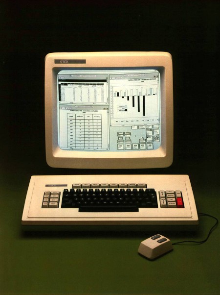
You’re looking at the Xerox Star which “represented the most complete implementation of the ‘Desktop Metaphor’ of any system until the advent of mature Desktop graphical interfaces later on the Mac and PC/Unix/Linux in the 1990s” [source:digibarn] Digibarn has posted up several Polaroids from 1981 depicting the various facets of the Star 8010’s interface (a few of which are shown below). I don’t know what’s more amazing: how ahead of it’s time this GUI was, or how little the OS interface has changed in the past 28 years. This was nearly three decades ago and we’re still clicking folder icons and using archaic pointing devices. Where’s my Minority Report interface!? My wrist hurts.
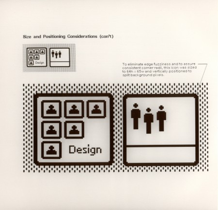
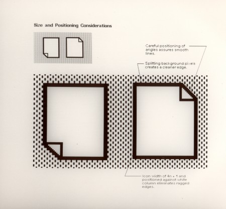
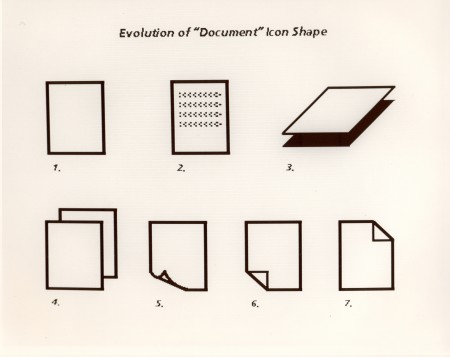
Check out all the rest of the hi-res Polaroids here.

This clear interface almost looks better than those glossy buttons from nowadays.
Talking of GUI have you seen this video…
http://www.fubiz.net/2009/03/17/microsoft-sustainability/
This would really sort out your wrist problems!
I sent you an email recently, but I presume it didn’t get through the junk filters… 🙁
but even that “Microsoft Sustainability” idea is stolen from the Xerox Palo Alto Research Center, there was an article in The Wire or maybe mondo 2000 in the early 90ies that showed all this GUI stuff Xerox had developed during the 70s & 80s
The guy who founded the company I worked for was one of the designers of the UI for IBM’s OS 2. Pretty crazy to think about UI so early on…it’s come a long way, but it’s got a much, much longer way to go.
Your minority report GUI is right here…
http://sublog.subimage.com/2008/11/15/minority-report-interface-is-real